Rambol #1 Review
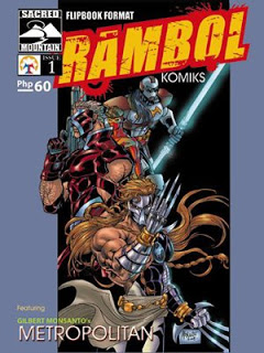
 Metropolitanâs cover was really cool. Iâve seen that several times at the web already but I honestly didnât notice Robie until I had the issue in my hand. As I read, I discovered that most characters have been redesigned and upgraded. Izzy and Robie grew up, the Biotrog here is actually the son of the original one we knew in Kick Fighter (see pages 11 & 12), while X-Trooper had a different costume and looked a bit older (page 14). Of all the characters though, Biolante was the one I didnât recognize the most. He looked really cold and, well, really different.
Midguard, on the other hand, died really early on. But of course, I am expecting a resurrection and a costume upgrade some time soon (I doubt Monsanto will kill a character close to his heart just like that). Iâm just kinda disappointed that Kampeon has become a villain here because he has always been a personal favorite. Maybe heâs just hypnotized or brainwashed or something. I donât know. Iâm excited to find that out in future issues.
For me, Metropolitan #1 really proves that Monsanto isnât merely a great illustrator but a superb writer, as well. Each of Metropolitanâs 22 pages is so action-packed that it doesnât have any spaces for dead-air moments. Monsanto clearly has the ability to take anyone to an adventure so wild that one canât help but ask “whatâs next?” Everything is really unpredictable - unpredictable in a good way. For example, seeing X-Trooper blast Biolante would make anyone expect that he was there to rescue Biotrog. but then again, that is definitely not the case as we see on the last page.
For the things-to-improve section, I guess some artwork on some pages looked rushed. I donât know. Maybe Monsanto was trying to beat deadlines and all but it looked obvious that pages 16 and 17, for example, didnât get as much attention as pages 7, 9, 20 & 21.
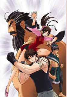
 The other story, Alagad Inc, was actually a Manga-inspired collaboration between Gilbert Monsanto (writer) and Kriss Sison (artist). The cover looks like weâve got a team out of King of Fighters here - and I mean that as a compliment.
Anyway, the plot is interesting. Itâs about a group of agents who need to settle their differences and face the challenge of the Gods and save the world from sure destruction. each of the four heroes were ordinary-looking characters with ordinary-sounding names. Furthermore, each of them looked distinct from one another but I guess I found something they had in common - speed and strength. Boy takes down a big American guy in less than 5 seconds, Bea kicks a huge soldier without the soldier even noticing her, and Haji uses his fists to knock a Tikbalang down. Diego didnât show his skills and abilities in this issue just yet but letâs wait when he gets his turn on future issues.
Speaking of the Tikbalang (a half-man, half-horse creature), well I personally have never been interested with stories that deal with it. but somehow, Sisonâs artwork really changed my mind. He illustrated the Tikbalang so well that i decided to stick around. Needless to say, I wasnât disappointed for doing that.
The night vision goggles scene (page 19) was an intelligent concept, I think. It shows one of the advantages of the medium of comics compared with film and television such as doing a narration during a very suspenseful part of the story. I think that idea was really brilliant. Monsanto is a real genius when it comes to story-telling and thankfully, Sisonâs illustrations enhances the story even more.
Admittedly, this is my first time to come across Sisonâs works. He really did great in this issue. Aside from being meticulously-detailed in his drawings (I liked the way the villains looked), I think his strength lies in his capacity to convey impact. Youâd feel that his characters and objects are really moving because of the way he does the backgrounds (see panel 3 of page 5 for a good example of that).
I really enjoyed Rambol #1. Iâm sure new and old readers alike will love this issue, too. I just hope the next issues will be in full colors. Seeing the first few pages in colors really makes me wish weâd have the entire thing fully-colored next time around. I bet that would add impact to the stories and would increase the bookâs appeal even more.
All in all, Iâll rate Rambol #1 as two thumbs up - way, way up!
Related Posts
4 Responses to “Rambol #1 Review”
Leave a Reply
Other interesting websites
- Non Gamstop Betting
- Casino Non AAMS
- Casino Non Aams
- Non Gamstop Casino
- Migliori Siti Casinò
- UK Online Casinos Not On Gamstop
- UK Casino Sites Not On Gamstop
- Meilleur Casino En Ligne
- Non Gamstop Casinos UK
- Non Gamstop Casinos UK
- Non Gamstop Casinos Uk
- Best Betting Sites Not On Gamstop
- オンラインカジノ 日本
- Non Gamstop Casinos UK
- Non Gamstop Casinos
- Casino Non Aams
- Siti Scommesse
- Migliori Siti Casino Non Aams
- Casino Online
- Gambling Sites Not On Gamstop
- Casinos Not On Gamstop
- Casino Sites Not On Gamstop
- Casinos Not On Gamstop
- UK Casino Sites Not On Gamstop
- Casino UK Sites
- Meilleur Casino En Ligne France
- Casinos Not On Gamstop
- Casino Non Aams
- Sites De Paris Sportifs Belgique
- Meilleur Casino En Ligne Belgique
- Siti Scommesse Bitcoin
- Casino En Ligne Fiable
- Paris Sportifs Ufc
- ブックメーカー
- Casino En Ligne 2026
- Casino En Ligne Francais
- Casino En Ligne Français 2026
- Meilleur Casino En Ligne
- Casino En Ligne Français 2026
- Casino En Ligne Fiable

yeah. i felt that too about certain pages. Have you seen the new preview pages that includes other characters like Deathstorm?
Do you mean the Rambol #4 cover? If yes, yup Iâve seen it. If not.. Whoa! Where can I find one?.. Iâd love to see that too.
Ayos ahh…
Detailed review…
Napasarap eh. Heheh.. Anyway, its nice to know that there are others, aside from me, who are patient enough to read this long review.
Iâd love to review Kalayaan, too. Paano kaya?